Daniel Morales's Blog
CSS3 Font Smoothing
October 13, 2016
 My development battle-stations are actually 2 my desktop PC which runs DEBIAN and my Macbook for Swift stuff and any other on-the-move coding.
Because of this and specially when I'm writing demos or examples to send to people, future clients or just a co-worker I end up checking the projects on both computers; usually there aren't many differences (visually) but one thing that I always get is how the FONTS are displayed on both ends.
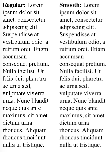
Fonts, the defaults ones, or those who come from 3rd party services are shown pretty smooth on my Debian PC (Firefox, yes I'm a Firefox guy); but when i switch to my Mac they are displayed 'pixelated' or just with a weird look.
The other day I ran into this CSS code:
-webkit-font-smoothing: antialiased;
-moz-osx-font-smoothing: grayscale;
The code is self-explanatory but it does the trick. I'm still not quiet sure why this differs from PC to PC, I guess its related how fonts options are managed by the S.O.

I'm a 32-years old programmer and web developer currently living in Montevideo, Uruguay. I been programming since I was about 15 y.o, and for the past 12 actively working in the area.